Roman Half-Uncial: Aspect
The overall aspect is upright, wide, and rounded. This effect is created by:
Spacing and Proportions
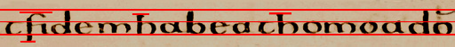
- Space between lines is about 1˝ times the height of the space between headline and baseline,
to allow for the long ascenders and descenders. The page looks fairly clear though a little
crowded: ascenders and descenders, not to mention abbreviation marks, do in fact encroach on each other's space.
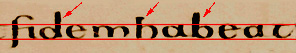
- Ascenders and descenders are about the same height again as the body of the text:
though the ascenders on l, b,
and d are usually taller than those on h, and the curved
ascenders of s and f:
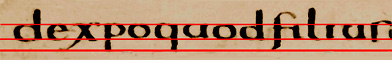
- Spacing is fairly though not completely regular, and letters are close to each other.
The flourish on x overlaps adjacent letters:

- For aspect ratios, see above.
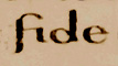
- The cross-stroke of e is slightly above the middle of the letter.
The cross-stroke of f is nearly on the head-line. All horizontal strokes
(there are not many) are extended to touch the following letter.
- The ends of curved letters also tend to join with the following letter:
Though this is not yet 'joined-up writing', the curves and the letters which touch give a cursive feel overall.
Return to Question Page.
© MEG TWYCROSS 1998