 |
o is roughly 1:1, |  |
c is roughly 1:1, |
 |
e is roughly 1: |
 |
while m is roughly 1:1 |
| Roman Half-Uncial |  |
 |
 |
| Insular Half-Uncial |  |
 |
 |
The general impression is rounded, weighty, even, and fluent.
The rounded effect is created by:
|
o is roughly 1:1, | |
c is roughly 1:1, |
|
e is roughly 1: |
|
while m is roughly 1:1 |
| Roman Half-Uncial | |
|
|
| Insular Half-Uncial | |
|
|
However, the letters look balanced because of the triangular serifs at the top. This distributes the weight of the letter more evenly about the vertical.
It looks weighty because:
| Roman Half-Uncial |  |
 |
 |
| Insular Half-Uncial |  |
 |
 |

 |
and the ends of the ascenders and descenders are often slanted. |  |
It looks even because
The 'fluent' effect is created because:
 |
This reads Et profetis (line 14). Here the cross stroke of the e has been pushed up to the head-line, so that it merges with the head-stroke of the t. |
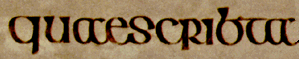 |
This reads quae scribta (line 13). |
The combination of unfamiliar letter-shapes and conjoinings produces some misleading effects:
 |
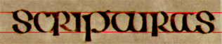
This reads hic aliquid (line 6). |
 |
The o+c-shaped a can look like a cc, while the open-bowed d can look like c+l. |
 |
This reads at illi (line 7). |
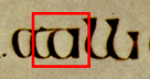 |
The t and the following i could be mistaken for a modern 'handwritten' a. |
If you are confused, pick the sequence to pieces letter by letter. See for example the sequences at the beginning of lines 10 and 4:
 | |
 | |
 |
 |
Return to Question Page.
© MEG TWYCROSS 1999