 |
 |
 |
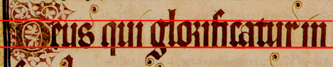
| o is 2:1 | m is 1:1 | e is 5:2 |
Upright, narrow, compact, supremely even, with wide verticals, angular: the diamond-shaped serifs at the tops of the minims give this script its characteristic 'picket fence' look.
The aspect ratio of our test letters is:
|
|
|
| o is 2:1 | m is 1:1 | e is 5:2 |
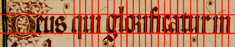
The script is evenly spaced between the head- and base-line. This is emphasised by the way the feet of the minims are cut off neatly on the base-line:
Only the curves of the s overflow the baseline.
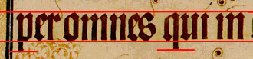
Minims and all uprights are vertical and extremely evenly spaced. The space between minims is only slightly wider than the minims themselves, which gives a very compact look.
Ascenders on h, l, and tall s are less than half the height of the body of the text: the ratio is about 7:3.
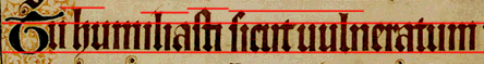
The rest (b, d) are even shorter.
Descenders are about the same proportions below the line as the shorter ascenders are above: see e.g. p, g, and q
| All the curves in Early Gothic have become angles. | |||||
 |
 |
 |
 |
 |
 |
| Even letters which still retain some curve are angled wherever possible: | |
 |
The top part of g is a slightly bulging
hexagon with a sharply angled curve on the closed tail. |
 |
Even the short s, which looks like an
overbalancing figure 8, is made with sharp turns of the pen. |
The pen is angled so that \ strokes are wide, whereas / strokes are hair-fine, the width of the pen moving horizontally.
 |
This gives the impression that the tops of letters which had originally been curved are now made up of two contiguous angled strokes. |  |
|
The spaces inside o or d appear to be quadrilateral, whereas the outside edges are hexagonal. They are also about the same width as the vertical penstrokes. | |
Serifs
The tops of minims have marked diamond-shaped serifs.
 |
 |
 |
|
Though in this hand the different letters are kept quite distinct, in some hands they just appear as a run of minims whose serifs touch at the top to create the 'picket fence' look.
 |
But just in case the reader might be misled, the scribes have started marking the top of an i with a hairline stroke. This is the beginning of our 'dotted i'. | |
The ascenders on b, l, and h have a concave curve at the top:
|
 |
|
Return to Question Page.
Return to Index Page.
© MEG TWYCROSS 1999