| Textura Prescissa |  |
 |
 |
 |
 |
 |
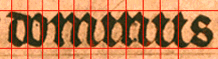
| Textura Quadrata |  |
 |
 |
 |
 |
 |
This script is essentially the same as the Textura Prescissa in the preceding week, except that it has feet. These are sometimes like diamond serifs, but usually more elongated
| Textura Prescissa | |
|
|
|
|
|
| Textura Quadrata | |
|
|
|
|
|
Again, it is upright, narrow, compact, with wide verticals, and angular. This particular hand is rather squatter than that of the Luttrell Psalter, and has a rather cursive swing to it. The foot of the last minim of m almost curves upwards. The angles at the top of the letters, instead of being perfect diamonds, are slanting strokes, sometimes with a slight upwards flick.
The aspect ratio of our test letters is:
 |
 |
 |
| o is 3:2 | m is 3:4 | e is roughly 5:3 |
The script is evenly spaced between the head- and base-line:

Uprights are evenly spaced and vertical, though when you get in close, they appear to curve slightly around the vertical.
Ascenders on tall s are very short, about one fifth of the body of the text:

The rest (l, b, d) are even shorter: they hardly rise above the head line at all.
 |
 |
 |
The longer descenders project slightly further below the virtual base-line: e.g. the descender of p is about one-quarter of the whole letter.
They are contained inside the actual ruled baseline.
The effect is that of a chunky script in which the diamond serifs and heavy feet are dominant features. The curves on the minims gives a slightly cursive effect. Though this is not actually joined-up writing, many of the feet do touch the letters next to them.
Return to Question Page.
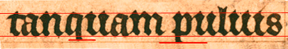
This is a regular even hand: the curves at the feet of the minims give it a strongly cursive appearance.
In many respects its aspect is very similar to that of the Quadrata above.
The main differences are that

The flicks are so pronounced that sometimes they make it difficult to tell whether the minims are meant to be mn, um, imi ... The i is not 'dotted'.
Return to Question Page.
Return to Index Page.
© MEG TWYCROSS 1999