
Bastarda is essentially a bookhand version of a cursive script. In fact in the more formal versions the letters are not joined together much more than they are in Textura Rotunda or even Semi-Quadrata, but they look as if they were meant to be. The aspect leans slightly forward, as if it was in a hurry.
The downstrokes are proportionally thinner in comparison with the sturdy Textura minims, and wider apart. They also curve noticeably. Upwards-rising oblique lines are very narrow indeed, almost hairline-thin, made with the pen held at a sideways angle.
| Bastarda |  |
 |
 |
| Textura |  |
 |
 |
and the geometrical letters like o, e, and d have recovered something of their curves, though they are still constructed with sharp turns of the pen:
 |
 |
 |
 |
 |
 |
 |
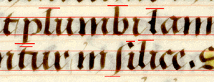
Letters like tall s and f lie on a forwards-leaning plane and have a sweeping flourish to them |  | |
|
Rounded letters like o, e, and a come to a point at the top right-hand side. | |
 |
 |
Sometimes this point develops into a little horn. |  |
 |
 |
Bowed letters like b and h have developed a pronounced point at the leading edge of the bow, which is pulled back sharply at the bottom towards the upright. They also begin with sharp upwards hairline flicks. |  | |
 |
When a word ends with a t it is sometimes finished with a vertical hairline stroke. This may sometimes look like an abbreviation or a punctuation mark, but it appears to be purely decorative. |  | |
The aspect ratio of our test letters is:
 |
 |
 |
| o is 10:9 | m is roughly 2:3 | e is 10:7 |
The script is evenly spaced between the head- and base-line, though in this hand they sometimes overflow a little:

Ascenders on tall letters like b, l, and s
are getting longer again, about one half of the body of the text.
Descenders like those on p or q are roughly the same,
slightly more than a half of the body of the text.
The ascenders on b and l are much longer than we have seen them for a while, only slightly shorter than the body of the text, which gives the script its characteristic spikiness. The ruled lines act as a guide for the top and bottom of tall s, and the tops of l and sometimes b.
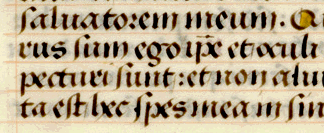
The ruled line also acts as a line of demarcation for the backwards-lying flicks which finish letters like h and m. It is however closer to the baseline than it is to the headline, so the descenders on p and q sometimes go through it, and encroach on the next line's space.
Return to Question Page.
Return to Index Page.
© MEG TWYCROSS 2000