 |
|
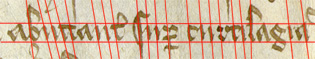
Charter A (Saffron Walden, Essex, 1401) is written in Latin in a stylish upright Secretary hand, narrow and even. It gives the impression of a bookhand, despite being cursive.
Aspect ratio of our test letters is:
 |
 |
 |
Letters are made with angles rather than curves:
 |
 |
 |
 |
 |
 |
 |
 |
Even where there are curves, they start with an angular change of pen direction:
 |
 |
|
 |
Descenders are protracted, and taper towards the ends:
 |
 |
|
|
Ascenders are often finished off with scything forward-facing curves:
 |
|
|
 |
The sense of regularity is partly produced by the saw-toothed pattern of the minims:
 |
 |
Note how the i is 'dotted', and the last stroke of the m extended to help the reader find his way about.
If we go by the minims and ascenders, the writing in fact slopes slightly backwards:
The width of the pen is on the downstrokes and loops from top left to bottom right. The sloping upstrokes are much narrower, virtually hairlines .
 |
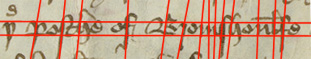
Charter B is written in English, in a competent but casual-looking Secretary, with no particular pretensions to elegance. It looks less mannered than the preceding example partly because the letters are not always even, partly because there are more curves and fewer angles.
Aspect ratio of our test letters (though they are not always regular, and it is difficult to know how much of the on-strokes to include) is:
 |
 |
 |
Minims are still angular:
 |
 |
 |
 |
 |
But bows tend to be curved:
 |
 |
 |
 |
And the flourishes at the top of ascenders are either curved or tending that way:
 |
 |
 |
 |
 |
For a more detailed comparison of the letter forms of the two hands, go to Letter Forms.
The impression of unevenness is partly caused by the way the minims tend to decrease in size. There are also fewer words in English with a very long run of minims: the spelling system altered u to o to avoid just this:
 |
 |
Though it is difficult to measure them because the writing is so cursive, the uprights generally lean forward:
The width of the pen is on the downstrokes, but he also turns it so that horizontal-lying curves can be wide as well. Characteristic of Secretary is the extra weight put on the downstrokes of s and f, which tend to taper towards the end:
 |
 |
Return to top of Question Page.
Return to Index Page.
© MEG TWYCROSS 2000