|
|
|
|
|
|
462 APPENDIX TO PART II
in our Venice;1 only not quite generally so white; and with this further exception, that while Turner gets his dark side dark upon cloudy white sky, Veronese boldly throws his entire building light and dark, white out from the blue sky behind: and only brings the dark side of the cupola in the distance dark against distant sky, by which he gives solidity to the whole. Turner, keeping the same building tone, gets his nearer building dark; his distant one light against sky, and so gives distance and dreaminess to the whole. The most essential difference is in the cast shadows, Turner being, though not darker, more decided. There is a degree of false assumption in this, as the general white tone of Veronese is far more possible without, than with, cast shadows. Yet I saw to-day (Monday, 10th September) that Veronese was very nearly right, even in sunshine. After a vain attempt to get into Library, we drove to the Arc de 1’Etoile, when a little, very little exercise of self-denial on my part was rewarded by my verifying this important effect of Veronese. The Arc de 1’Etoile is of a warm limestone (marble?), not very pure or fine in colour; but whiter than Caen stone. The sky 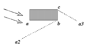 was blue, varied with white clouds. The sunlight in the direction of the arrows giving a broad dark side with comparatively little reflected light-no walls near, but the ground, observe, very dry and white. Standing at a and looking at the corner b, the base of it came vigorously dark against the pale blue of horizon, while the top, where the eye was very much dimmed, appeared as though a Daguerreotype would have pronounced it to be as nearly as possible of the pitch of the sky at that angle perhaps 35-40, with, nevertheless, a nuance of light on the stone; while to the eye undimmed, it was pronounced in clear warm light upon the blue. On this pale dark side the ornaments were, for the most part, traced in darkness; the richer ones and under cornices as dark masses; partly owing to the crowding of their line, partly to discoloration, but for the most part, they might be drawn with a grey pencil in pure lines upon the warm dark; looking from a3 towards the side b c, that side appeared of a pure transparent ochre, much warmer than a b, and all of it vigorously dark against the sunlight sky at bottom and top. White clouds, by their opposition, threw the feeblest of the darks into deep shade on the one hand, and the figures, especially coloured ones, threw them all into clear light on the other, almost in the Veronese key. This principality of figure tone is a most characteristic feature with Veronese, and I was delighted to see him thus confirmed, as well as Turner in his Venice. Yet note that this truth referred only-or rather was seen only-in the two dark sides: retiring so as to see the illumined sides, another key came into the picture, a warm strong light nearly up to that of clouds, casting all the rest into dark grey, and touched like fire on the shelly crests of the cornice. Turner endeavours to unite this with the pearly grey: being perfectly true in the
1 [“The Grand Canal, Venice,” sometimes called “Shylock,” exhibited at the Academy in 1837, and afterwards bought by Ruskin’s father; sold by Ruskin in 1872; now in the collection of Mr. Ralph Brocklebank.]
|
|
|
[Version 0.04: March 2008]