 Back to maps
If you have any suggestions or find any bugs please email Alison at
a.c.hale@lancaster.ac.uk with the details.
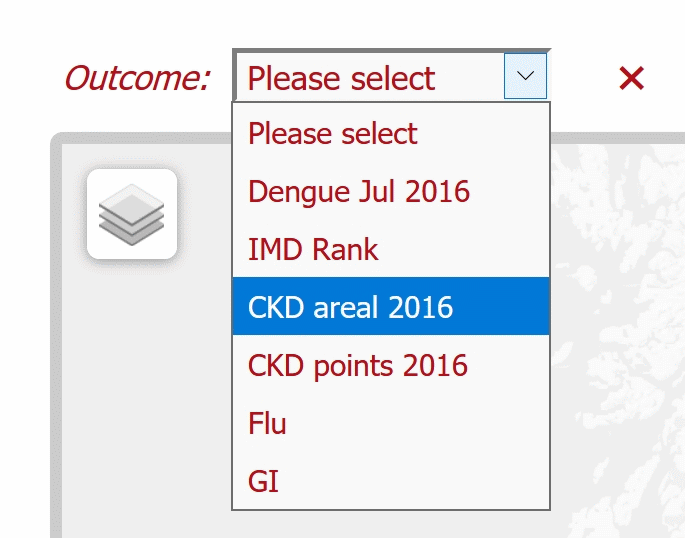
View a map by selecting an "Outcome" from the drop down menu or, if applicable, radio buttons.
Clicking on a sub-region of the map gives details specific to that sub-region in a white pop-up box on the map. In this example it names the sub-region as "E01005737" with a value of "0.026"; this value is consistent with the colouring on the map legend.
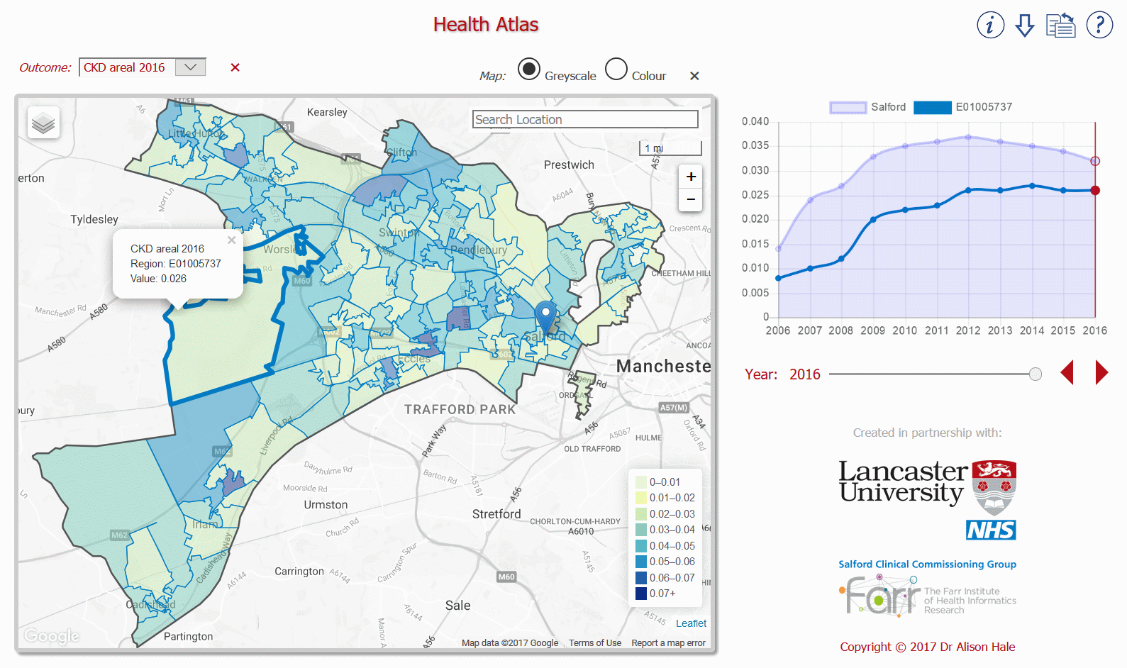
In this example there is temporal data for the years 2006 to 2016 as shown on the timeseries figure next to the map. The vertical red line on the timeseries indicates that the whole map is displaying data for the year 2016. The slider and arrows under the timeseries enable the whole map (not just the selected sub-region) to display data for another year (or whatever the time increments are in the data). Hovering over a point on the timeseries displays its value. The light blue shaded area on the timeseries relates to the whole region within the exterior (dark grey) boundary on the map (e.g. all the Salford LSOA sub-regions) and the dark blue line relates only to the sub-region which has been selected (here LSOA sub-region "E01005737"). Any dark blue points within the light blue shaded area on the timeseries figure are below average compared with the whole region, conversely dark blue points outside this shaded area are above average. In this example sub-region "E01005737" always falls within the light blue shaded area, so it is consistently below average compared with the whole "Salford" region; i.e. the risk of CKD is below average in "E01005737".
The map pane includes:
• a "search location" text box in which any place name can be typed
• the distance scale which the map is using (e.g. 1 mile = 1 mi)
• the +/− zoom buttons, which change the scale of the map
The blue place marker on the map is located, in this example, at the centre of the City of Salford.
The base map may be displayed in either grey scale or colour by using the appropriate radio buttons situated directly above the map pane.
The icons situated on the top right of the web page are for:
• getting information about the map data
• downloading map data
• toggling the web page layout between landscape and portrait
• opening this help web page
Back to maps