HOW TO DESCRIBE SCRIPTS
How can you describe these features?
European writing is made up of a combination of
 | straight lines |
 |
and curves |
|
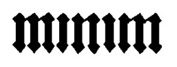
Straight vertical downstrokes are called minims.
|
 |
| Closed curved strokes are called bows.
|
|
Horizontal strokes are called after their position on the letter:
 |
- a top horizontal stroke is called a
head-stroke
(e.g. on T).
|
 |
- a centre horizontal stroke is called a
cross-stroke
(e.g. the middle stroke on A).
|
 |
- a bottom horizontal stroke is called a
base-stroke
(e.g. on L).
|
In order to keep the writing even, the scribe
ruled straight lines across the page,
sometimes with a pen, sometimes with a metal stylus. Look at the manuscript
page featured
in the previous section: the lines there are ruled in dark pink. (We shall see more of this when
we do the Codicology part of the course.) In fact, scribes tended to write above
these lines rather than on them.
In order to measure scripts, however, we draw a line
along the bottom of the main body of writing. This is called the
baseline.
A line ruled along the top of the main body of writing is called the
head-line.
If you have letters, parts of which stick up above the headline, or drop down below
the baseline,
- the part which extends above the headline is called the
ascender;
|
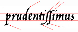 |
- the part which extends below the baseline is called the
descender.
|
Serifs
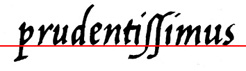
Serifs are the short strokes which begin or terminate a penstroke, curved or straight.
Their main purpose is to make the ends of these strokes look tidy: however, they can be elaborated to a degree where they become a major stylistic feature of a particular script.
For example, they can be
| flicked, |  |
or triangular, |  |
| or diamond, |  |
or forked. |  | |
A script without serifs is called a sans serif script.
| This is TIMES NEW ROMAN, the most popular modern typeface with serifs. |
| This is ARIAL, the most common modern sans-serif typeface. |
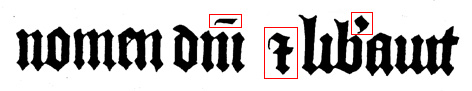
Ligatures
A ligature is the conjoining of two letters so that they share the same stroke:
Abbreviations
Scribes developed a whole armoury of abbreviations in order to save time, labour, and parchment, or as part of the design of the page layout. You will be learning the more common of these during the course.
Aspect
The aspect of a script is its overall look: is it upright or slanting? is it relatively tall and narrow or short and wide? is it rounded or angular?
All these features will be apparent at a fairly casual glance: however, they can also be measured.
The aspect ratio of a letter is its height:width ratio.
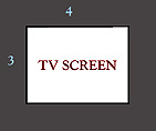
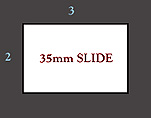
(Compare the aspect ratio of a television screen, which is (currently) 3:4, with that of a 35mm slide,
which is 2:3.)
You can get a good idea of the aspect ratio of a script by measuring
the letter O.
|
How does this Roman Rustic O |  |
compare with this
Carolingian Minuscule O ? |  |
Other useful questions are:
- At what angle to the vertical are the uprights?
- At what angle to the vertical are the diagonals?
- Are the bows circular or oval, upright or slanted? (Some scripts even abolish curves
on the bows for angles.)
- Where are the penstrokes thickest, on the verticals, or the diagonals, or even the
horizontals?
- Are the letters 'close together' - i.e. what proportion of empty space is there between
the minims, and how does it relate to the thickness of the strokes?
- Are the ascenders/descenders long or short in relation to the body of the text between
headline and baseline?
...
|
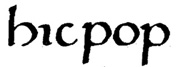
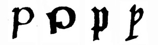
Try out your observation on these four different types of P from four different scripts.
Return to the Index.
© MEG TWYCROSS 1998