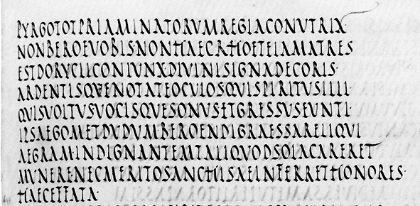
Vatican Library MS Pal. Lat. 1631, the 'Vatican Virgil' or 'Codex Palatinus': a 6th-century copy of an earlier original.
This section is from Book 5 of the Aeneid. How can you tell this
?
The line numbers in a modern edition are 645-653.
1. Why did I ask you to use capital letters?
Because this is a majuscule script: Latin
maiusculus means 'somewhat larger'. Scripts are usually classified as either
majuscule or minuscule (note the spelling):
minusculus means 'somewhat smaller'. They correspond roughly to our
upper-case and
lower-case.
However, their use does not have the same implications: the whole script is either majuscule or minuscule. See lesson on
Artificial Uncial for the beginnings of our system of ‘capital letters’.
2.Copy out a line, using pen and ink. What do you notice about the mechanics of writing?
Feedback, please!
3. What is the overall aspect of the script? Measure it.
Despite the curl of the parchment which appears in the photograph, the base and head-lines are even.
Uprights are vertical, with slight variations, because the script is rather cursive. Where they are off-vertical, they tend to lean slightly back.
Diagonals are slightly curved, which makes drawing lines through them difficult. The general effect is quite even.
 |
Aspect ratio of an O, width to height, is just under 2:1, which makes the script look tall and narrow. |
 | Some of the letters, such as E and T, have very narrow head- and cross-strokes, which adds to this impression. |
| However, it looks slanting, because: | |
 |
Width (broad pen strokes) is on the diagonals, not the verticals. |
 |
Bows are oval: thin part of the ovals are top left and bottom right, not centre top and centre bottom: |
 |
Bows on R, P, B are very narrow and oblique: whole letter gets wider towards the bottom. This is an overall characteristic of Roman Rustic letters. Indeed, even the vertical penstrokes get wider towards the bottom . |
 |
Cross-strokes are about two-thirds up; the upper bows of B, R, P also end on this cross-line : |
 | Serifs and horizontal strokes are flicked and curved like a tilde ~ : |
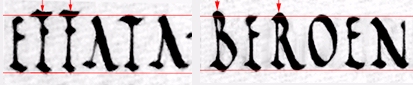
4. How are the letters drawn in relation to the baseline and headline?
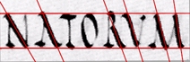
Some project above it, notably F, B and R.
 |
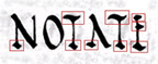
5. What do you notice about the forms of the letters, in comparison with modern typefaces? Are any of them strikingly different from modern letters?
 |
A and H: A has no cross bar, and H is more like a set of rugby goalposts. | |
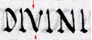 |
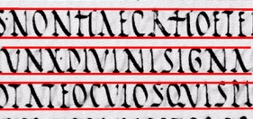
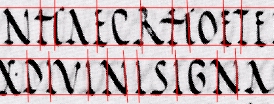
As with Roman Square Capitals, there is no distinction between U and V. The two words here are 'DIVINI' (as in our divine), and 'OCULOS' (as in our oculist). | 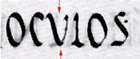 |
Which could you get mixed up?
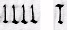
| I, L, and possibly T: |  | E and F (n.b. F is taller than E, but you may not notice this if they do not occur together). |
6. Do you notice anything interesting about the layout?
No word-division at all.
However, the text is laid out in lines which correspond to the
lines of hexameter verse you can see in the modern edition.
What does this imply about
the habits of the original readers, and the purpose for which the text was written?
7. Is there any punctuation?
Dots at midline height. These have a different function from modern full stops. What is it?
 |
| Q V I S V O L T U S · V O C I S Q V E S O N V S · E T G R E S S V S E V N T I · |
8. Is there any ornamentation?
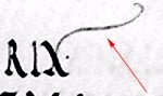 | Yes, a flourish on the X at the end of the first line, and an extended head-stroke as a flourish to the T in line 7. |
Return to transcription page.
Return to Index Page.
© MEG TWYCROSS 1998