TRIGGER WARNING! This blog posts refers to COVID-19 and fatality rate data – if that’s something you’d rather avoid then, not to worry, you can head back here where I have lots of other blog posts for you to read!
We all know that Statistics is a powerful tool that has great significance in the real world. More recently, with coronavirus daily briefings and COVID-19 Statistics dominating the news, everyone one and their mother is a self-proclaimed statistician. Because Statistics inform so many big decisions, when it comes to analysis, we need to tread carefully. After all, things might not always be what they seem at first glance! In this short post, I’m going to introduce the Simpson’s Paradox, a phenomenon in Probability and Statistics.
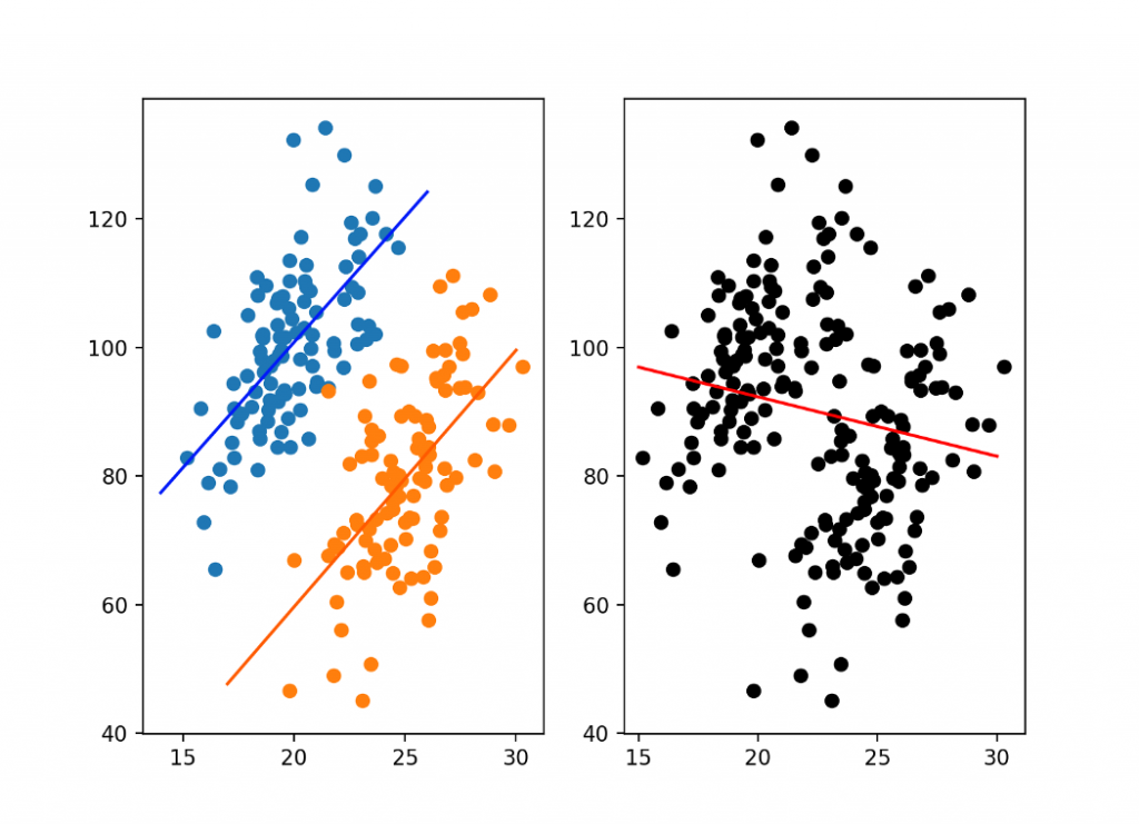
The Simpson’s Paradox occurs when the same set of data can appear to show different analysis depending on how the data is grouped. This happens because there is what’s known as a lurking variable hidden in the aggregated data. Take a look at the graphs of simulated data below, the graph on the left-hand side separately considers two groups. In this graph, we observe a positive correlation in both groups. In the graph on the right-hand side, all of the data is grouped together and we observe the opposite, a negative correlation.
In real-life examples, this can have detrimental effects. I’ll show you what I mean! Take the next graph. Here, we’re comparing fatality rates for COVID-19 in Italy and China based on different age groups. Notice that for every age range, the fatality rate is higher in China than it is in Italy, suggesting that people in Italy who have COVID-19 are more likely to survive than people in China with COVID-19.
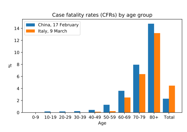
Great. Our analysis is done, no? We can now get carried away reporting these findings and firing all sorts of criticisms at the Chinese health service as we take this analysis as gospel. That’s until we notice the last two bars on this graph. The aggregation of all this data suggests the opposite, that people in China have it better with a lower fatality rate than in Italy. But how on earth can this make sense? Let’s look at another graph:
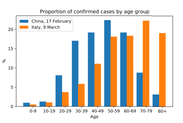
What is key about this graph is that it shows that there is a significantly larger population of older people with COVID-19 in Italy than in China. This is important because we know that age places a crucial role in the survivability of COVID-19, with younger people more likely to recover.
So, how does this graph help explain our conflicting analyses? Well, there is a statistical link here between each country and the proportion of confirmed cases per age group. In this case, this is our lurking variable, the fatality rate percentages in the first graph hide the numbers of cases within each age group. As Italy has more older people with COVID-19, overall their fatality rate is higher because these people are more at risk of dying than younger people. So, even though for each age group Italy has less deaths than China, the fact that Italy has a much larger number of older people with the virus plays in significantly to the overall figures. Put simply, the larger proportion of confirmed cases among older people in Italy shown along with the fact that elderly people are generally at higher risk of death from COVID-19, explain the discrepancy between the aggregated and categorised data. This is a perfect illustration of Simpson’s Paradox.

This is really important and a clear indication of how we can get the totally wrong idea from the statistics when we’re not paying enough attention. Regarding the pandemic, we’re commonly given country-wide statistics. If we were to group by region or county we may draw vastly different conclusions. Nationally, we could observe a decline in COVID-19 despite a rising number of cases in some areas (which could potentially signal the start of a third wave). This is likely to happen if there are groups with large disparities, such as areas with vastly different populations. A spike in cases in a less dense region is likely to be dwarfed by falling cases in a largely populated area, like London for example, in national data.
There are so many other examples or instances where the Simpson’s Paradox can play a role in hiding information. We have to be careful in the ways we divide data and be mindful of potential lurking variables. You’ve been warned!
That’s it for now! This week’s tweet of the week goes to @helenczerski!
Missed my last post? Check it out here.
Want to know more?
This post is based on the observations of the Simpson’s Paradox found in this paper: Simpson’s paradox in Covid-19 case fatality rates: a mediation analysis of age-related causal effects