In this course you are going to learn how to
|
Besides this you will learn about the most common abbreviations used by medieval scribes, and about the rise of punctuation and the use of capital letters .
Your acquisition of these skills will be gradual and cumulative. Much of it will come through the eye, just be looking at the different shapes of letters and layout. Some will come through the hand to the brain as you copy.
The history of the change from one script to another is partly a matter of style - even fashion - and partly a matter of efficiency and suitability to the job in hand. It also depends upon the media they used to write in and with.
Style
Think of the history of clothes and their silhouettes. We get our eye in to particular shapes
and proportions, and then the fashion changes.
In writing, there tends to be a swing from very angular scripts to very curvaceous scripts to very angular ones and back again.


It could be argued that some writing styles echo styles of architecture, as do styles of dress.
Efficiency or
Fitness for Purpose
What is this particular script meant for?
|
You will be able to think of many other uses.
Medium
A script intended for carving on stone or wood will be different in kind from a script written
with quill pen and ink on parchment.
What is 'easy to read'?
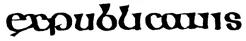
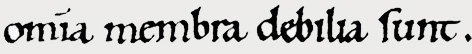
This partly depends on what you are used to. Most of us will find this legible
The same probably applies to most of the letters in this,
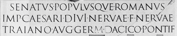
This is because Italian Renaissance printers thought it was the script used by the Romans to
write classical texts. In fact, it dates from the Carolingian Renaissance under the Emperor
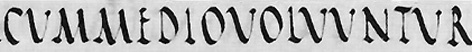
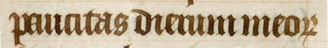
Charlemagne, when most of the surviving classical texts were copied. The genuine classical text was more likely to be written in this:
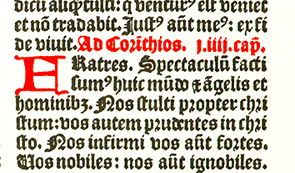 When Northern European printers created typefaces,
they attempted to imitate the favoured formal bookhand of the time, which was Gothic textura.
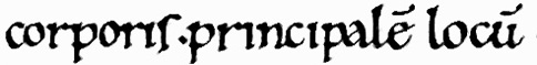
The earliest English typefaces looked like this, which was perfectly legible if you were used to the script:
When Northern European printers created typefaces,
they attempted to imitate the favoured formal bookhand of the time, which was Gothic textura.
The earliest English typefaces looked like this, which was perfectly legible if you were used to the script:
However, there are degrees of clarity in different scripts which make some easier to read on
early acquaintance.
Besides this, legibility is affected by the layout of the page: the space between letters,
the space between words, the space between lines. We shall be looking at this as we go through.
Method
Each week we will look at a new script and ask:
How is this different from the one for the previous week
|
Move to the next page for information on how to describe different features of a script.
© MEG TWYCROSS 1998
Return to Index.