
Lancaster leads the way in the fight against Neglected Tropical Diseases

International efforts to eliminate NTDs are using methods invented by Lancaster University statisticians to draw their maps and decide exactly where they have achieved their targets of eliminating these diseases.
NTDs include Leishmaniasis, Rabies, Chagas disease, Dengue and Chikungunya, Leprosy, Trachoma, Scabies and African trypanosomiasis.
In 1998, three Lancaster statisticians – Peter Diggle, Rana Moyeed and Jonathan Tawn - invented so-called model-based geostatistical methods to map the prevalence of NTDs.
Professor Peter Diggle is head of the Centre for Health Informatics, Computing, and Statistics(CHICAS) NTD Group at Lancaster University which currently includes Benjamin Amoah, Claudio Fronterre, Emanuele Giorgi and Olatunji Johnson.
He explains more: “Type “Neglected Tropical Disease Map” into Google images and you will be presented with a plethora of world-scale maps showing each country as a single colour-coded patch. As we move towards the goal of eliminating an NTD – which typically means reducing its prevalence to an agreed level rather than eradicating it altogether – a world-scale map is of limited use.
“Let’s take an example in which the agreed threshold for elimination is 1%. You live in a country that announces proudly that it has achieved a national prevalence of 0.9%. The announcement would be of little comfort to you if, underneath this national average local prevalence varies between, say, 0% and 10% and you live in what might well be a local hotspot. You would want to consult a within-country map that tells you what the picture is where you live. And it’s not easy to construct such a map.
"When we look at maps in everyday life, we tend to believe that what they display is true…be it height above sea-level or the locations of cities and towns. But how, in a poor and largely rural country, can you map the prevalence of what you hope is a rare disease?
“First, you need some data. Fundamentally, you need to travel round the country looking for cases of the disease, work out what proportion of their respective communities they represent and somehow turn that into a map of the whole country. In the picture above, the motorcyclist is doing just that.
“He’s a field epidemiologist. He may have left home several weeks ago. In every village he visits, he needs to get permission to test a sample of the village inhabitants for the presence of a particular disease. Most NTD’s are chronic conditions that are initially asymptomatic and the aim is to treat people so as to prevent an infection progressing to full-blown disease. To know if someone is infected, you have to test them, often by taking and analysing a blood sample, Our epidemiologist has neither the time nor the money that he would need to test everyone, so he has to settle for a sample. For the same reasons, he and his colleagues can only hope to visit a fraction of all the communities at risk of the disease.
“Let’s suppose that in one village, our epidemiologist samples 100 people and finds that 10 of them are cases. A superficial conclusion is that the disease prevalence there is 10%. A more honest conclusion is that prevalence is probably somewhere between about 5.5% and 17.5% - quite a big margin of error, and it gets harder as prevalence falls closer to the elimination target of 1%.
“This is where the so-called “First law of Geography” comes to the rescue. It states that all things are related but close things are more strongly related than distance things. What this means is that if we put our epidemiologist’s data on a map we might well find that villages close together give similar results, in which case we can combine the data from all these villages to get a more precise answer than for any one of them.
“In the map below, if I combine the data from 10 villages with the same true prevalence I might get the same superficial answer as before, namely 10%, but my honest answer would now be that the prevalence is probably somewhere between about 8.2% and 12.0% - a much smaller margin of error.
“More than that, by combining prevalence data with remotely sensed images of environmental risk-factors, we can build statistical models that give even sharper predictions of how likely it is that an elimination target has been reached, for any location of interest.
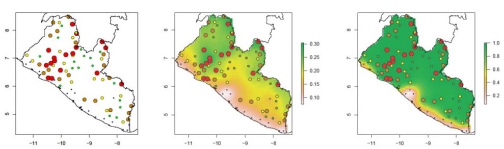
“The left-hand map below shows data on the prevalence of river blindness in a sample of village communities in Liberia (the bigger the coloured dot, the higher the prevalence in the sample). The middle panel exploits the First law of Geography to predict the variation in prevalence across the whole country. The right-hand panel shows how likely it is, for any location in Liberia, that the true prevalence is greater than 0.1 (10%). From this, we can be fairly sure (green areas) that at the time the data were collected prevalence was greater than10% in most of the country apart from a coastal strip (pale pink), with a “corridor of uncertainty” (pink to yellow) in between.”
Visit http://chicas.lancaster-university.uk/projects/ntd_consortium.html or ask your library for a copy of Model-based Geostatistics: Methods and Applications in Global Public Health, by Peter Diggle and Emanuele Giorgi
Back to News