Logos

A large white sign welcomes people to Lancaster University. It is surrounded by trees and hedges.

Lancaster University principal logo

A large image of the Lancaster University logo

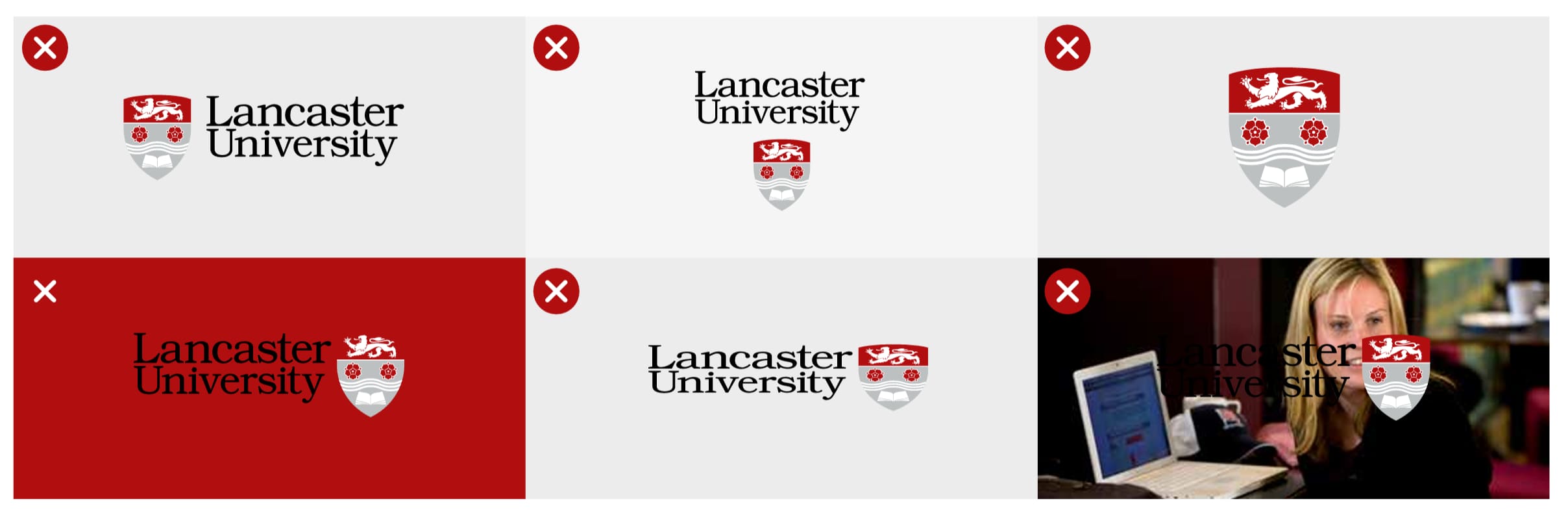
Our logo is one of the most important parts of our visual identity, so it’s important to maintain its integrity by using it consistently.

The words and the shield combined make our logo; the two elements should never be separated or adjusted in proportion or positioning.

To boost our brand recognition opportunities externally, use our principal logo in the first instance, instead of faculty, division or department logos.

Remember to always reproduce the logo from high-quality original artwork; this artwork is a protected trademark. Do not attempt to redraw any of the elements. You can download the logo pack below.

Reversed logo

An image of examples of the reversed-out logos

The reversed logo should be used on darker backgrounds or over photographic backgrounds when it gives a cleaner and more impactful result than the primary logo.

In this version of the logo, an additional grey stroke has been applied to the shield's edge to add definition.

Download our logo pack

Download PNG versions of our primary logo and our reversed logo.

Download our logos

Mono logo

Two examples of the mono logo

The mono version of the logo is available in both black and white. This version should not be used except in exceptional circumstances.

It is ideal for purposes such as branded promotional items, where the number of colours used may be restricted due to the production process.

Contact the Marketing Office if you think you need the mono logo.

For social media

Social media profile pictures can use the University shield on their own. The icons are too small to include any other text, such as your department, faculty, network, or even the University name. You can use the account name and the description to provide that information.

Positioning and protecting the logo

An image explaining the amount of white space required around the Lancaster University logo

The University logo is always the ‘hero’; its integrity and legibility must never be compromised. Wherever possible, the logo should be justified to the top right corner of a page.

To maximise the logo's visibility and impact, a protective clear zone must always exist around it. No other graphic elements should be allowed within this zone, which is established using the logo's height (U). This is the minimum recommended area, but more space around the logo will improve its visibility.

Minimum size

An image explaining the minimum size of the logo in print

Our logo should never be shown in print media smaller than 10mm in height. This is the smallest size the shield can be reduced to without losing integrity, becoming illegible, or distorted.

Lancaster University’s principal logo may have to be reduced to a simple, plain text version in very limited instances. This might be due to a restriction in a production process or the material it is being applied to. As this approach compromises our brand, please contact the Marketing Office before using it.

Misuse of the logo

An image with 6 examples of misuse of the logo

To maintain the integrity of the Lancaster University logo, please avoid the mistreatments shown on this page. The logo must not be manipulated or distorted in any way - no switching, no stretching and no separating please.

Partnerships and colleges

The Lancaster University logo should be used to reinforce brand recognition for the work and projects undertaken by the University. Creating new logos dilutes the recognition of the valuable work the University does, so it should be avoided.

Contact the Marketing Office for our affiliated brands and partnership logos in the carousel below.

Guidance about partnership branding

Lancaster University is a collaborative higher education institution. We believe that by working together with partners across different sectors we can use our collective intellectual and wider capabilities as a force for good and create positive economic, cultural, societal and environmental change.

To increase the impact and recognition of our partnership work, it is important to ensure that Lancaster University's involvement is visible.

Working just with Lancaster University

Where we are involved in a project or an event which has a separate visual identity, the appropriate partnership branding (shown below) should be used. This can be ‘locked up’ with the project or event logo where we are the only partner or shown nearby.

A range of logos for Lancaster University to display different partnerships.

Lancaster University as one of many partners

In instances where Lancaster is one of multiple partners our principal logo should be shown alongside other partner logos. Where space does not allow for multiple logos to appear (for example on small merchandise items), our logo should appear on the project or event website alongside other partner logos.

Where and how to use our logo

Our partnership branding logos are available in various formats from the Marketing Office.

The appropriate logo should be used on all collateral related to the project or event, for example webpages, social posts, banners, leaflets and merchandise.

Like our principal logo, the minimum height for our main logo is 10mm, and 18.5mm for the stacked version.

If in doubt on how and which logo to use, please don’t hesitate to contact the Marketing Office for help or to check.

A demonstration of the standard and stacked versions of the Lancaster University Leipzig logos.

A demonstration of the standard and stacked versions of logos.

The Marketing Office are happy to advise on any logo issues, including logos for funding bodies, accolades and accreditations. If you're thinking of creating a logo, please speak to the team to ensure our brand identity isn't compromised.