Typography

An upper and lower case A on a red background

Professional design fonts

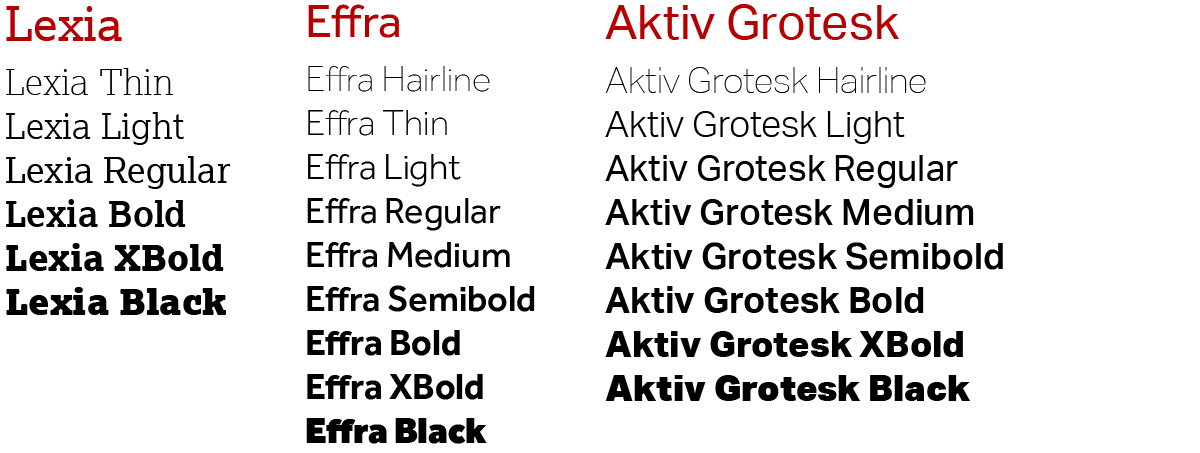
For professionally designed marketing materials and digital work, we use Lexia, Effra and Activ Grotesk.

Using slab and sans serif fonts helps reflect and reinforce Lancaster University’s personality. A slab serif font provides gravitas and authority, while a sans serif font is clean, modern, and easy to read as body copy.

Some design and digital specialists at Lancaster University have a license to use these fonts. External agencies will need to source the fonts themselves.

Quick usage guide

Primary headings – Lexia (slab serif font)

Secondary headings – Effra (sans serif font)

Body copy – Aktiv Grotesk (sans serif font)

Each of our fonts is available in a variety of weights:

An example of the different fonts used by Lancaster University

Fonts for internal use

For Word documents and other materials that do not need to be professionally designed, you can use the default Microsoft font, Aptos.

To ensure your Word document is accessible select the 'Custom' option in the 'Design' style sets and choose the 'Accessibility colours' option in the 'Colours' choices.